

Complete Guide to Corrugated Flute Types: E, B, and BC Explained
Feb 17, 2026
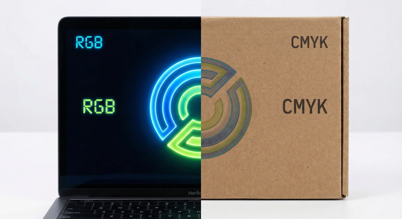
You have just received your shipment of custom printed boxes. You excitedly open the first carton, but your heart sinks. The vibrant, electric blue logo you designed on your MacBook looks dull, muddy, and lifeless on the cardboard. What happened?
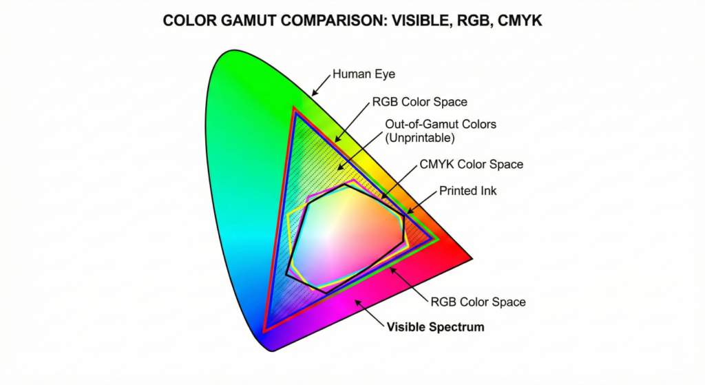
The culprit is the mismatch between CMYK vs RGB for printing.
This is the #1 pain point we hear from Procurement Managers and Brand Owners at Gangda Packaging. Your designer works in one color mode, but our printing presses require another. Understanding this difference is critical to saving your budget and your brand image.
To solve the “dull color” crisis, you must understand how color is created: