

The Complete Guide to Air Fryer Disposable Liners
Apr 03, 2026
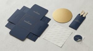
In the highly competitive world of retail packaging, color consistency is not just an aesthetic choice; it is a critical pillar of brand identity. Have you ever noticed how a leading brand’s signature color looks absolutely identical across different boxes, bags, and promotional materials worldwide? This flawless, uncompromising consistency is rarely achieved through standard four-color processes. Instead, it relies on a highly precise technique known as spot color printing. For businesses aiming to establish a premium and instantly recognizable brand presence in the global market, understanding when and how to utilize this advanced printing method is absolutely essential to packaging success.
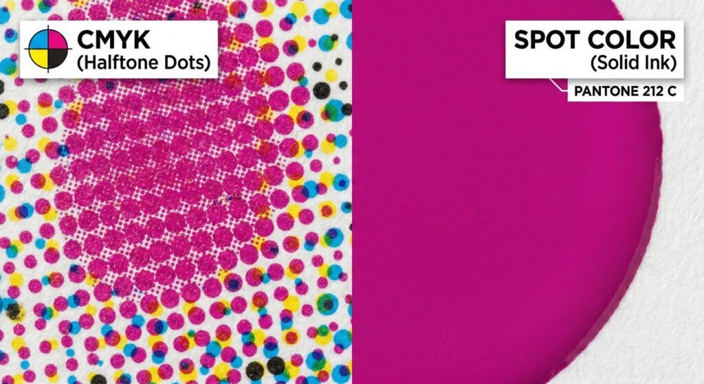
To fully grasp the concept of spot color printing, one must first understand the limitations of standard CMYK printing. In traditional printing (Cyan, Magenta, Yellow, and Key/Black), tiny dots of these four base colors are printed in overlapping patterns to create the optical illusion of various hues. While this is excellent for full-color photographs, it leaves room for microscopic variations from print run to print run.
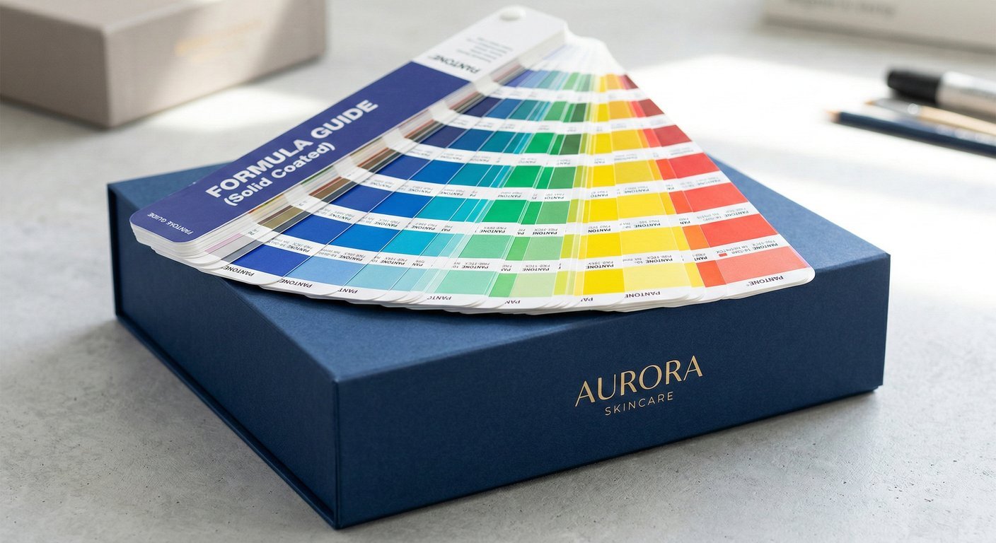
In contrast, a spot color is a pure, solid ink that has been custom-mixed prior to hitting the printing press. Instead of blending dots on the paper, the press applies a single, pre-mixed layer of ink using a dedicated printing plate. The global standard for this ink mixing is the Pantone Matching System (PMS). By referencing a specific Pantone code, manufacturers worldwide can create the exact same ink formula. You can read more about the technical history and formulation of this system by studying the principles of spot color technology.