

The Complete Guide to Air Fryer Disposable Liners
Apr 03, 2026
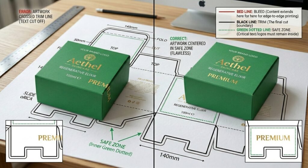
Have you ever received a batch of beautifully designed boxes, only to realize that the last letter of your brand name was sliced off during production? This costly mistake happens when designers ignore a fundamental rule of commercial printing: respecting the packaging design safe zone. By understanding how to properly set up margins, bleed, and safe areas, brands can ensure their artwork translates flawlessly from a digital screen to a physical printed box, preventing frustrating delays and financial losses.
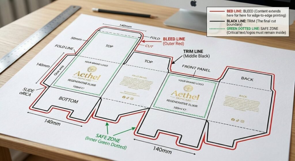
In commercial printing, the packaging design safe zone refers to the designated boundary on a dieline where all critical artwork elements—such as text, logos, barcodes, and essential graphics—must reside. Keeping these elements within this designated space guarantees they will not be trimmed away, creased, or folded improperly during the physical manufacturing process.
When paperboard or corrugated materials pass through massive industrial die cutting machines at high speeds, mechanical shifts are inevitable. Even with state-of-the-art equipment, paper can shift by roughly 1mm to 3mm during the cutting and creasing phases. If vital information sits precisely on the theoretical edge of the cut line, that standard mechanical tolerance will almost certainly ruin the final presentation.