


The Complete Guide to Air Fryer Disposable Liners
Apr 03, 2026
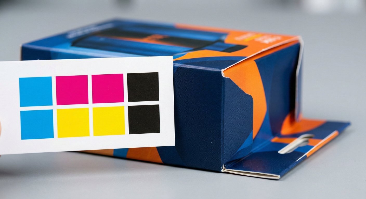
Achieving the exact color you envision on your packaging can be a complex and highly technical process. When transitioning from a glowing digital design on a computer monitor to physical ink absorbed into paper, slight variations are physically and mathematically inevitable. The key question for brands, designers, and manufacturers alike is: what constitutes an acceptable printing color difference? Understanding the threshold between a standard, normal production variation and a genuinely flawed print run is critical. It ensures you maintain strict brand consistency across all your product lines while minimizing costly and time-consuming reprints.
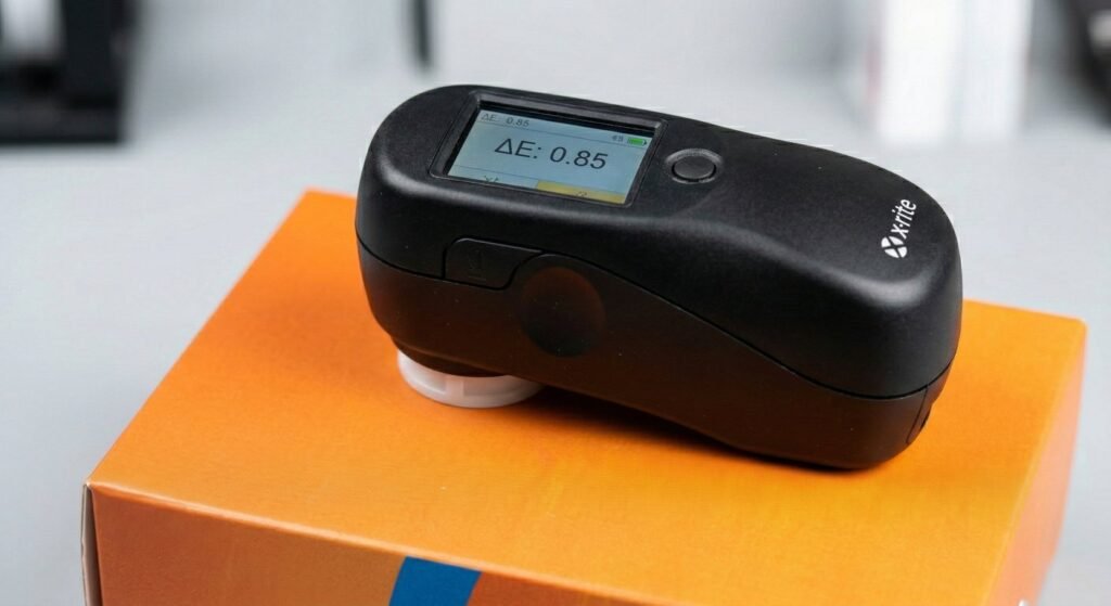
To remove subjective human judgment from color assessment, the commercial printing industry relies on a mathematical metric known as Delta E (ΔE). Delta E represents the distance between two colors in a given color space. By using a device called a spectrophotometer, we can measure the intended target color (like a specific Pantone match or a signed physical proof) and compare it against the actual printed result coming off the production line.
Understanding Color difference through the Delta E scale provides a universal language for strict quality control. Here is how the industry generally interprets these values: